
A reimagining of BigBasket, one of India's largest online grocery platforms, drawing from Indian basket culture and everyday grocery habits to create a visual identity that feels more rooted, recognisable, and relevant.
Project Link

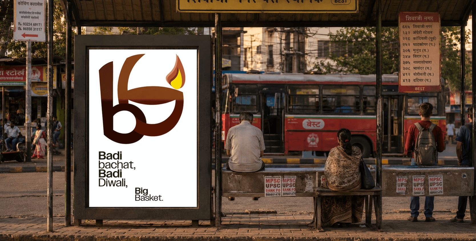

Stage 1
The project began with studying BigBasket’s existing identity, consumer base, competitors, and position within India’s growing online grocery ecosystem.
Stage 2
Multiple visual directions were explored through sketches, symbol studies, basket forms, typography experiments, and cultural references to identify a stronger brand narrative.
Stage 3
The final identity system was developed through logo refinement, color palette creation, typography selection, and brand guidelines designed for digital and physical applications.


The logo starts with two versions of the letter b. One follows a clean sans serif structure, while the other introduces the form of a traditional shopping basket through rounded curves.

When the two forms are overlaid, they create a looping intersection inspired by the weave of traditional nylon baskets.

Highlighting this overlapping section with a contrasting colour emphasizes the woven detail and brings the final logo to life.

The final logo draws from the visual language of traditional basket weaving, clearly incorporates the form of a basket, and places greater emphasis on the brand name.

While the redesigned logo explores a more rooted and meaningful visual language, the project reinforced the importance of recognisability at scale. For brands as large as BigBasket, clarity and instant recall are often just as important as storytelling and symbolism.


BACK TO TOP
